


Background: Theranova is a medical device incubator which has spun out six new companies in the past seven years. They recently received a $2 million NIH grant to move forward with their eMBLD (electronic menstrual blood loss diary) application to validate their proprietary software for FDA approval. They were looking for an app that would be used by each participant in the clinical study with the ultimate aim of a commercial product after FDA approval.
Role: UX Researcher, UX Designer, Project Manager, Client contact
Tools: Figma, Maze
Timeline: 3 weeks
The Problem
Users are participants in a women’s health clinical study that requires them to document used menstrual products for a single cycle. They need a way to successfully fulfill their role in the clinical study because the requirements are inconvenient and making multiple daily entries is cumbersome. Meanwhile, clinicians need a way to minimize participants’ noncompliance, drop out rate, and direct communication with the clinical site so they can collect a sufficient amount of accurate data.
How might we help a diverse group of users complete their study participation without error, be confident uploading sensitive data, and feel positive throughout a repetitive process?

Screens from the 2014 eMBLD design

Defining product functionality and end-goals
When we were brought on for this project, the original product team had disbanded so there weren’t clearly defined needs or goals for this product. We only knew the application would be used in data collection for an upcoming clinical trial, so my teammate and I asked to review Theranova’s research documentation and communications with the FDA.
We distilled 3 essential roles for the eMBLD app:

Navigating research at the intersection of healthcare & UX
We had to be mindful of discussing women’s health in user interviews so that we didn’t conduct research that would violate any regulations around personal health information. This led us to rely heavily on comparative analyses to understand industry standards for health apps. For user interviews, we focused on users’ behaviors with apps to track information on a daily basis and attitudes towards banking apps’ check scanning feature, which was another example of uploading sensitive information via phone camera.
Comparative Analysis Insights
While no commercial app was directly comparable to eMBLD, we analyzed interface elements and user flows from 7 other health applications. We also looked at banks’ check scanning features, then used affinity mapping to identify key insights.


User Interviews
7 participants, remote via Zoom
Goals:
Identify pain points associated with regularly entering data into an app
Understand what motivates users to consistently use an app
Determine what makes an effective reminder
Learn users’ expectations for uploading sensitive information via camera
Users need and expect:
Reminders and getting positive feedback on progress
Explicit feedback on security of app
Clear communication from the app on what they’ve done, are currently doing, and should do next
Clear and easily readable past data entries


Primary and secondary proto-personas: Sonya & Taylor
To keep user needs at the forefront of our design phase, we synthesized our interview findings into two personas.

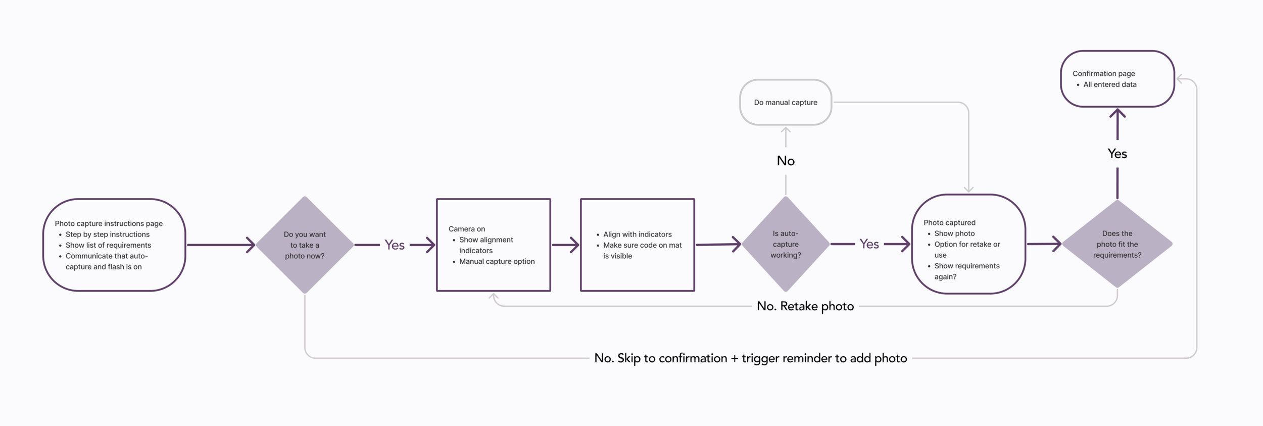
Designing the happy path for our primary persona
To align our team for the design phase, we used MoSCoW to define our MVP and agreed to focus on the onboarding and journal entry happy path first since these were the critical flows for meeting the business’ and primary user’s needs.
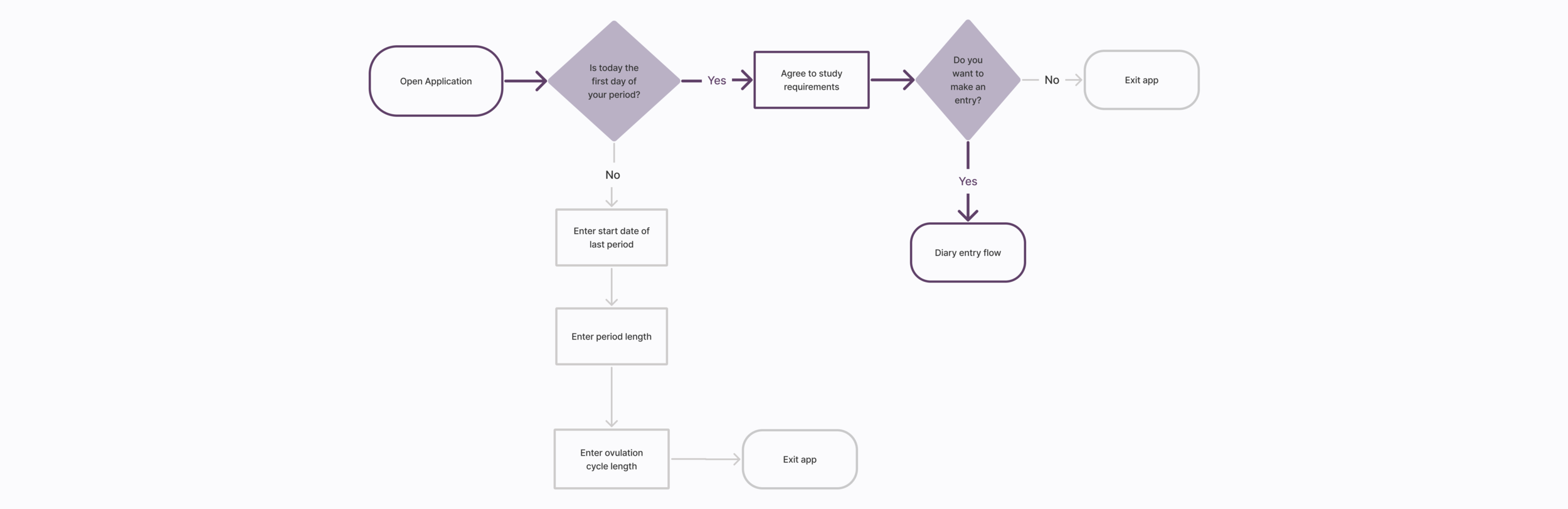
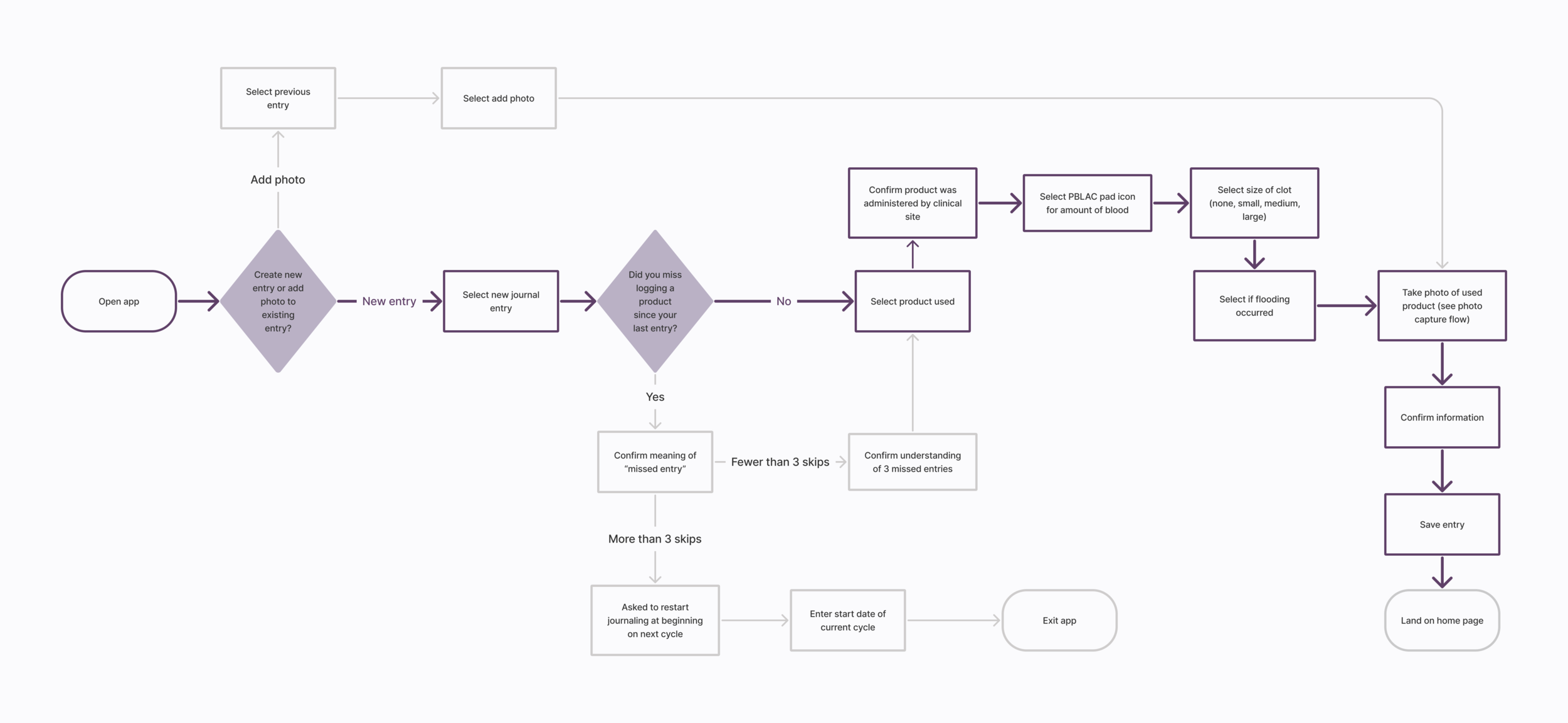
We divvied up the user flows among the team: I created the new journal entry flow. Happy paths are indicated by dark purple.

Creating some purposeful friction in a streamlined interface
Before our sketching workshop, we spoke with the potential development team to discuss technical constraints. We agreed to use Google’s Material Design system to simplify development and reduce costs.
Two of our most important decisions:
Use one card per screen for instructions and data logging, requiring a tap or swipe between each one.
Add friction to onboarding by requiring a check box and button tap. We hypothesized slowing down users during the study instructions would prevent more severe pain points later on, like having to restart their participation in the clinical study.
We decided to use a single card per screen to reduce cognitive load. We also added the mandatory button interaction to keep users actively engaging with the instructions. My sketch is on the left.
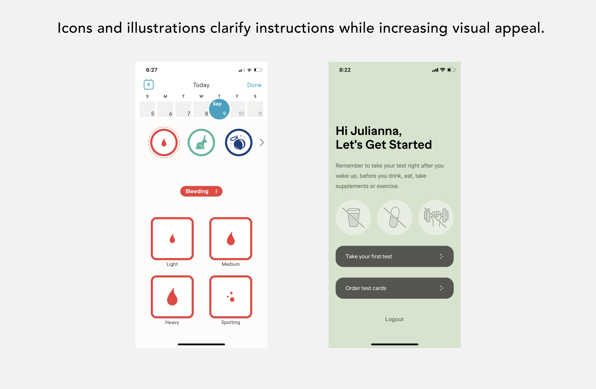
Sticking with a single card per page layout, we used images to visually supplement instructions and function as radio buttons in the interface. My sketch is on the left.

Flow and writing is intuitive, but layouts need simplifying
Lo-Fi Usability Results - 6 users via Zoom
High points:
100% success rate, average time on task: 3 min 26 sec
UX writing is a good balance of friendly and medical
Flow is intuitive
Call to action buttons are easy to find
Pain points:
Inconsistent card usage
Too many text sizes and muddled hierarchy
Double progress indicator
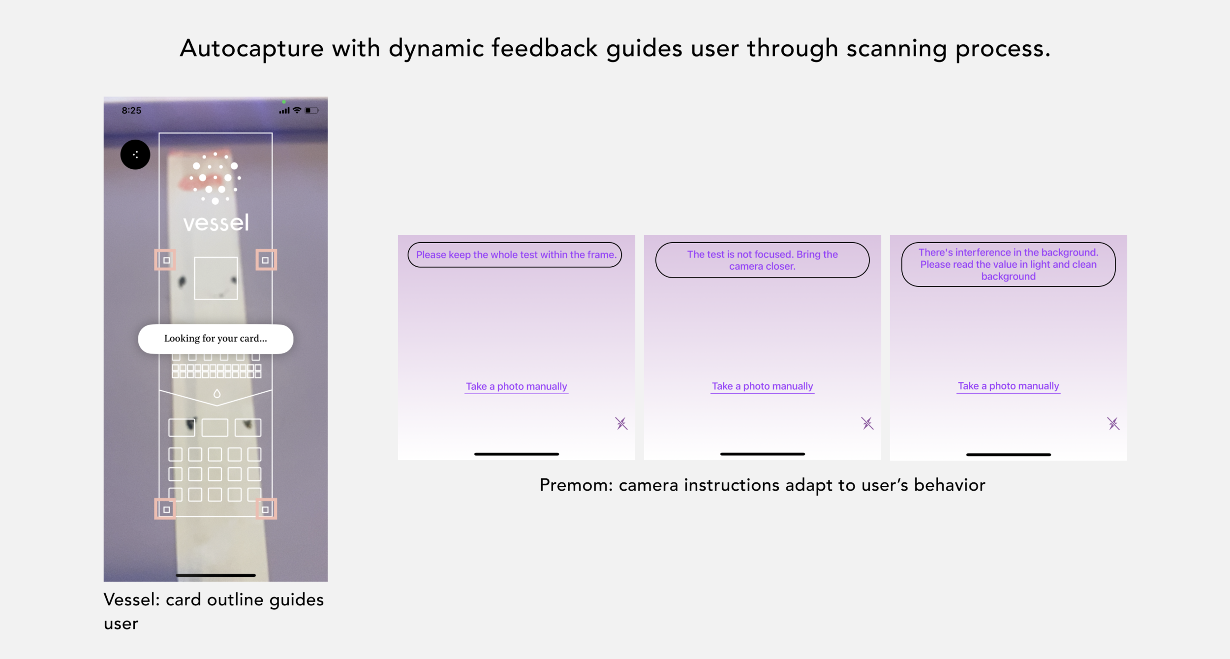
Unclear that autocapture and flash were on


Improving hierarchy, adding user-backed UI elements
After hearing some side comments about distrustful UI in user interviews, we decided to survey users about visual elements they associated with a women’s health app and a trustworthy medical interface. From 68 respondents, trends were overwhelmingly clear on color story and fonts: 62% selected the purple/citron color story and 59% selected the Raleway/Nunito fonts.

Decluttering the interface
- All journal entry cards represented by single progress indicator
- De-emphasize journal entry date & remove unnecessary title above card
- Specify instructions in the card title

Consistent cards
- Converted card layouts to be the same for all instructions
- Restructured text hierarchy to focus on most important content
- Eliminated largest heading text style

New layout for most important information
- Added note about autocapture nearby CTA for greater emphasis
- New layout for instructions explaining steps to be taken outside the app

2nd round of usability tests: where’d that button go?
To further simplify the navigation, we removed the primary action button from the onboarding and journal entry screens so that users had to swipe between the cards. We immediately learned our decision actually led to more confusion and went against our users’ expectations. Also, removing the button decreased the interface’s accessibility. It was a powerful learning experience: the button is back!
Hi-fi Usability Results: 5 users via Zoom, 21 users via Maze
High points:
10% decrease in time on task from first test
“I feel like it’s secure and legitimate!”
“I liked how I was walked through the onboarding process and everything was explained to me.”
Pain points:
25% bounce rate
“I wish there was an arrow button to go through the checklist”


Final Prototype
Note: The feminine product in this prototype is a mock up, not a real used product.

What I learned…
Text hierarchy: Simple interfaces should have simple layout hierarchies. Not every design needs 6+ text styles!
Bringing meaningful design to new spaces: Healthcare and research are industries that have grown largely without attention to user experience. Centering patients’ and participants’ needs through design is the work that inspires me most.
Collaborate with developers early: Knowing to use an existing design system was crucial for making this product viable. I’m excited to keep working cross-functionally in the future to ensure every design I touch can be executed with minimal challenges.
